
DIRTYBIRD WORDMARK & FONT
___ Logotype & Type Design
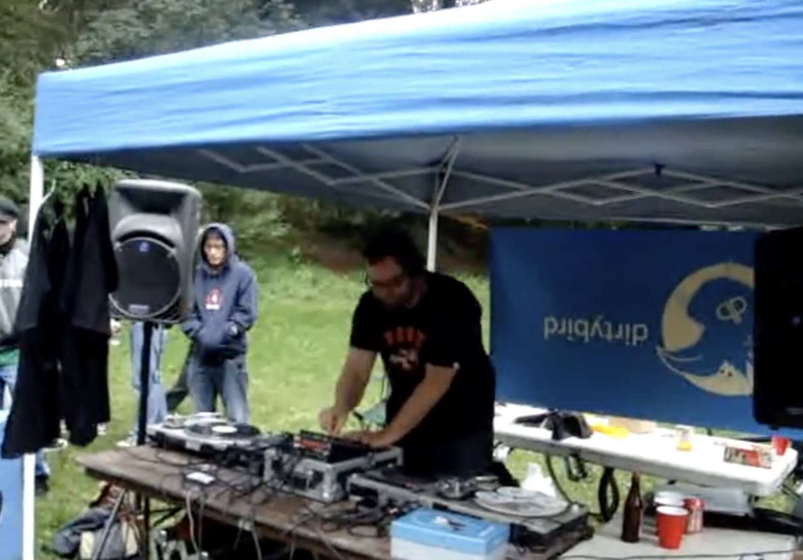
Before Dirtybird was a record label, it was a party in San Francisco. In 2003, a group of friends carried a sound system and a grill into Golden Gate Park and started throwing free Sunday gatherings built around house music, food and the simple idea of bringing people together. Roughly a dozen people came to the first one. The parties grew, the community followed, and in 2005 Claude VonStroke turned that momentum into Dirtybird Records. What began as a distinctly local piece of Bay Area culture would become one of the most recognizable independent names in American dance music.
Over the next two decades, Dirtybird grew into a cultural world of its own. Nearly 400 releases introduced and supported artists including FISHER, Justin Martin, Walker & Royce, VNSSA and Catz ’N Dogz, while Campout, the traveling BBQs, merchandise, art and a growing calendar of events turned an audience into something closer to a tribe. In 2017, Mixmag readers named Dirtybird Label of the Decade.
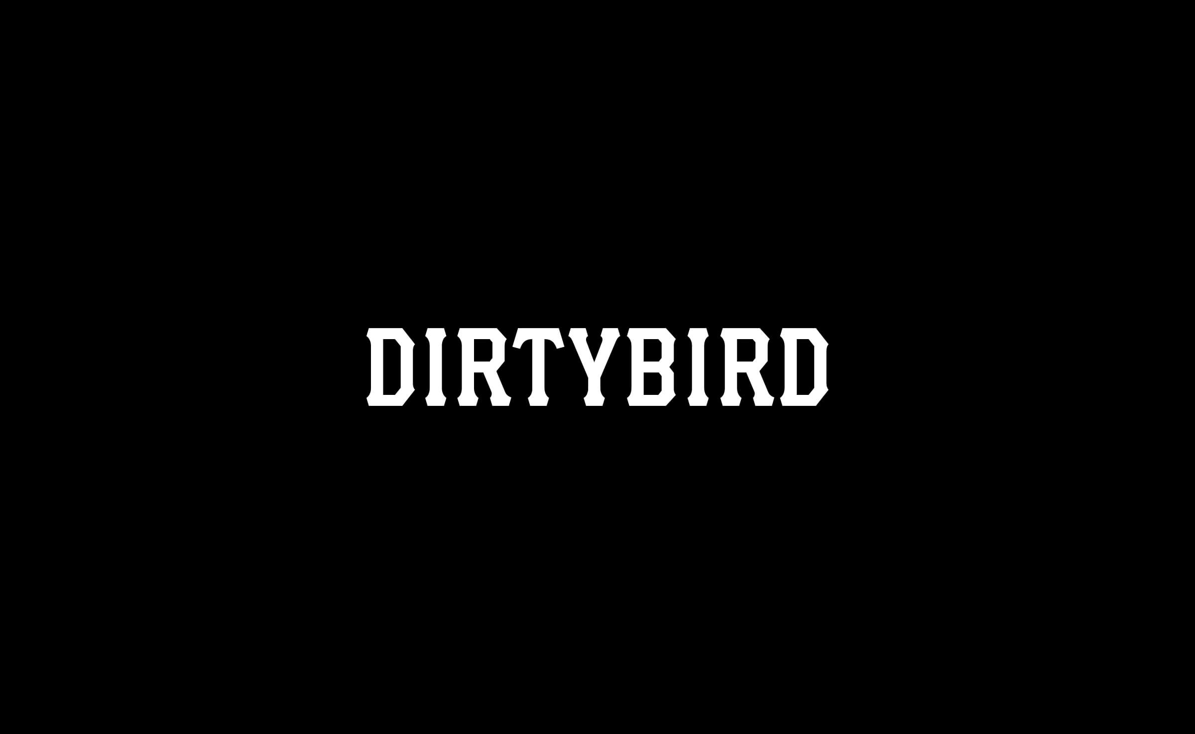
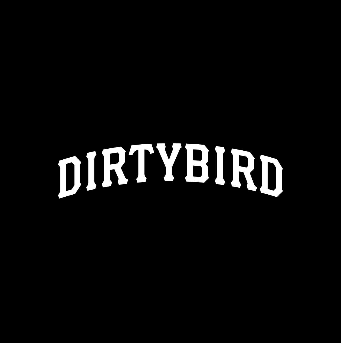
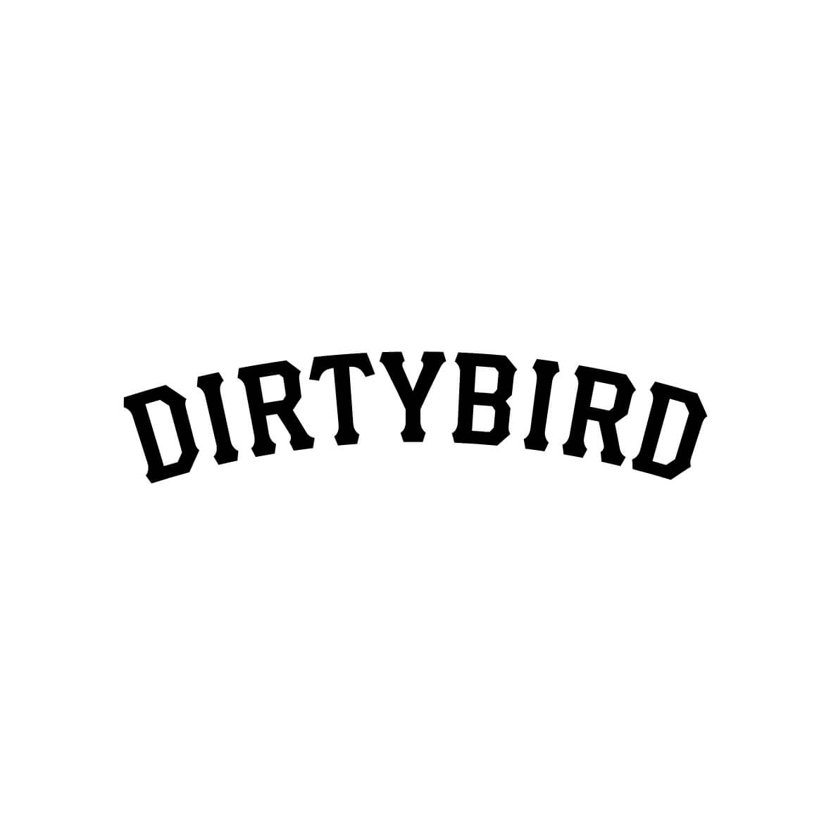
The iconic bird was already firmly established. Studio Picante’s founder, Chris Bernay, was brought in to redesign the Dirtybird wordmark, giving the name a stronger and more ownable voice without replacing the symbol people already knew.
Brand: Dirtybird
Industry: Music / Culture
Region: San Francisco, California
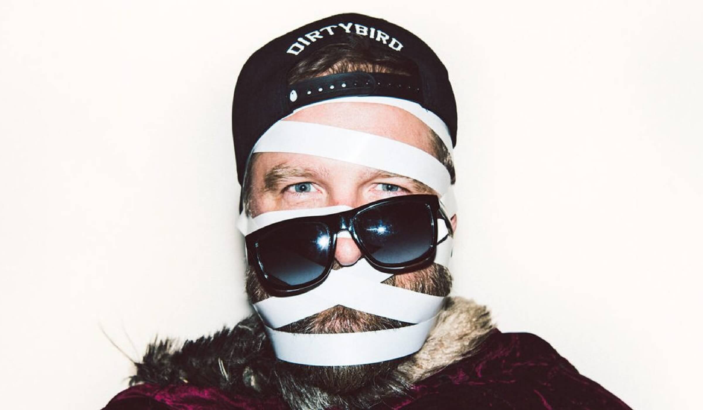
CARRYING THE LEGACY FORWARD
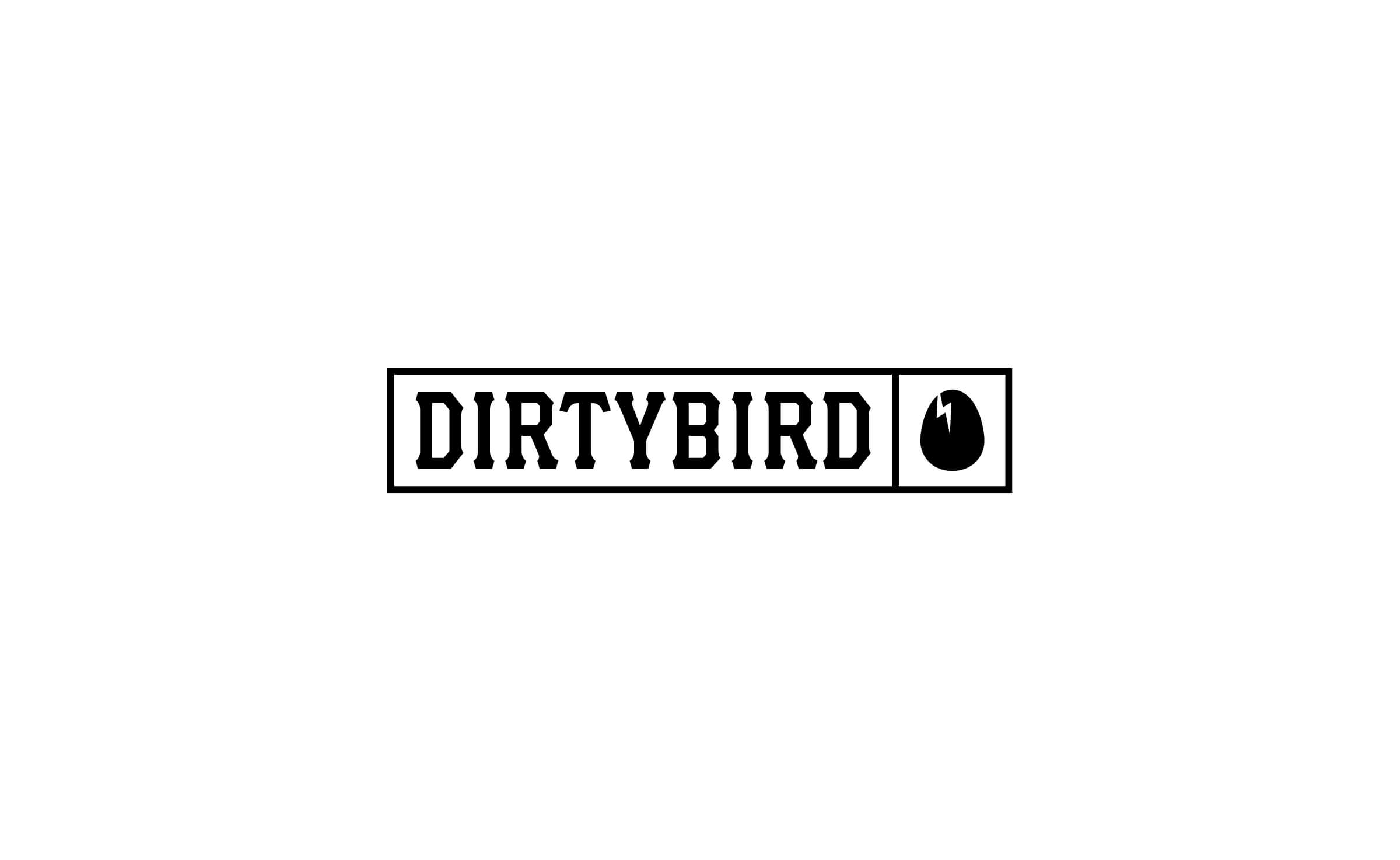
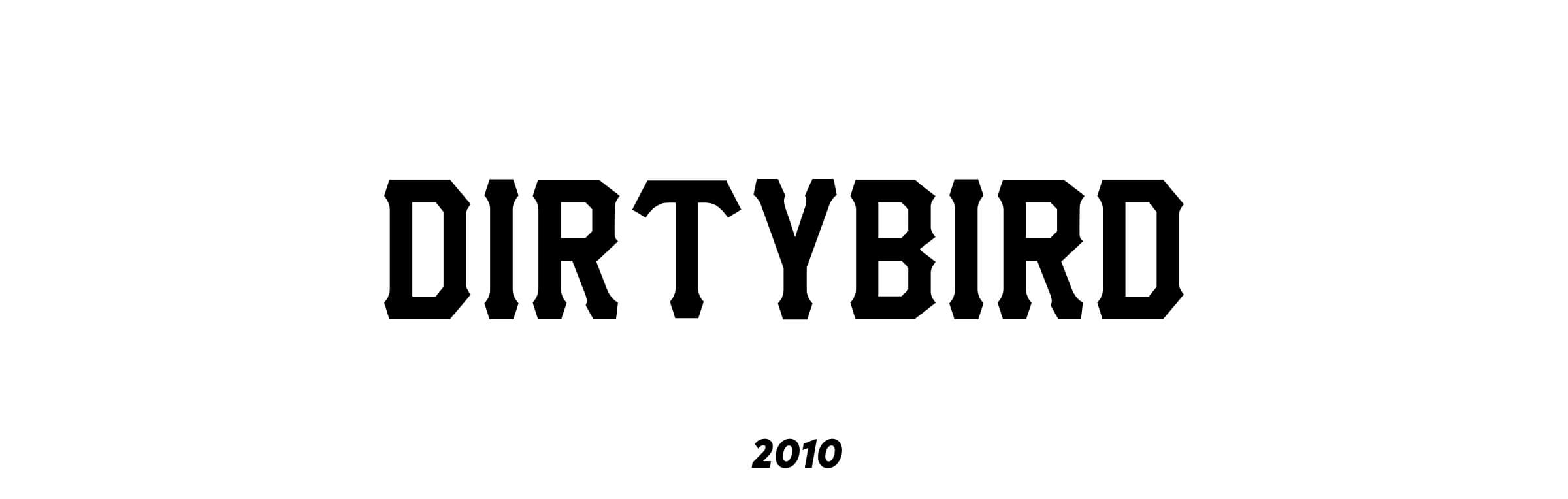
The previous Dirtybird wordmark had been built from a freely available typeface from DaFont. It had become familiar through years of releases and events, but the label had outgrown its dependence on an off-the-shelf font.
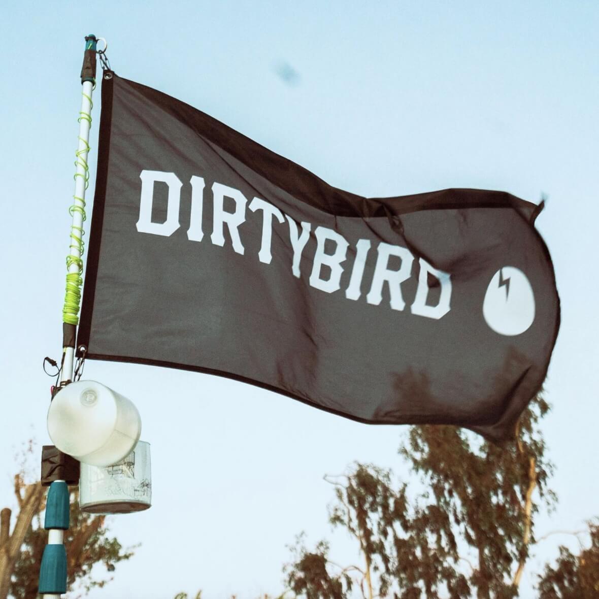
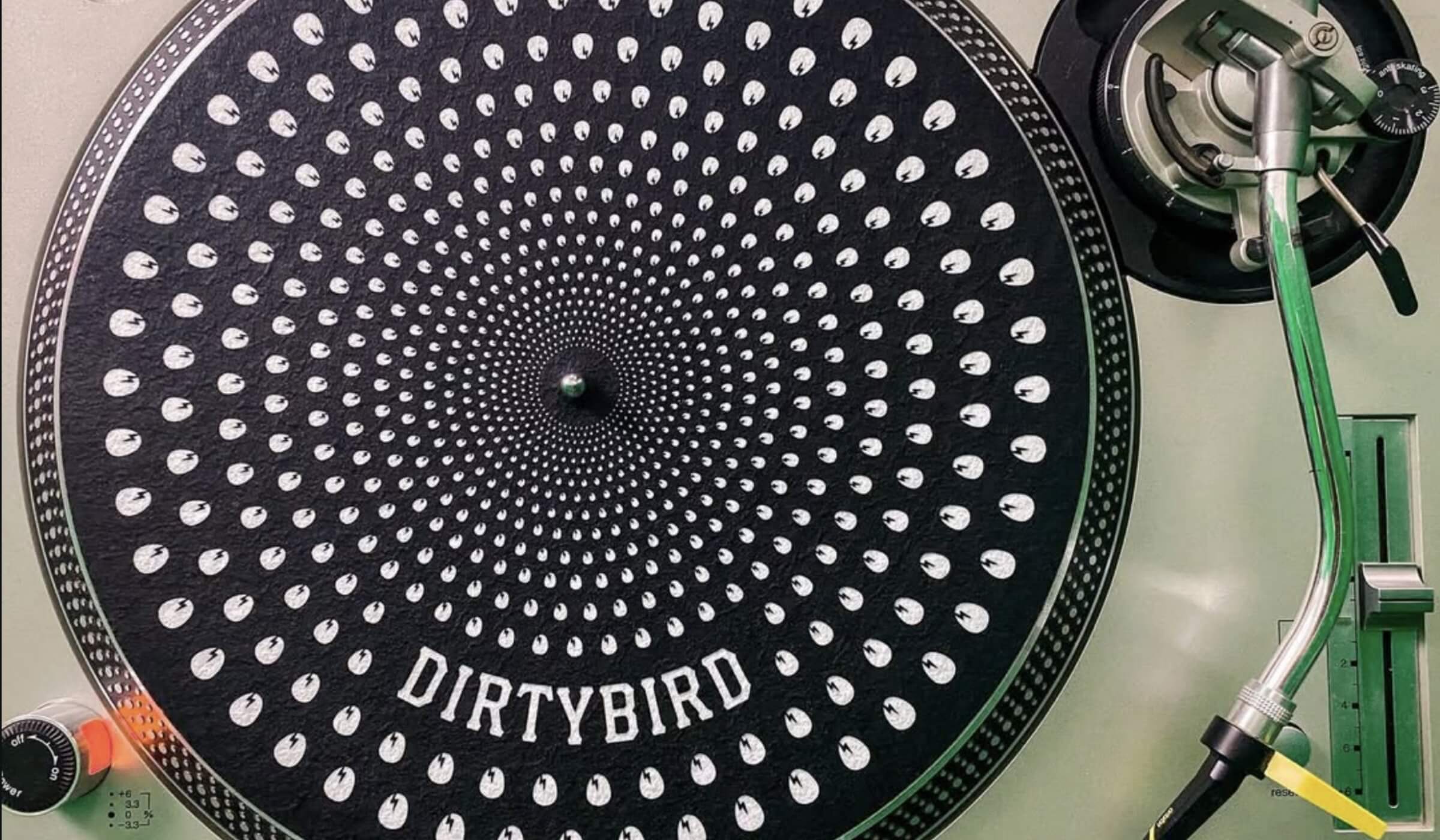
The redesign kept the recognition of the Dirtybird name while rebuilding the lettering from the ground up as a custom piece of typography. The goal was not to erase what came before, but to give an increasingly established cultural brand something it could own.
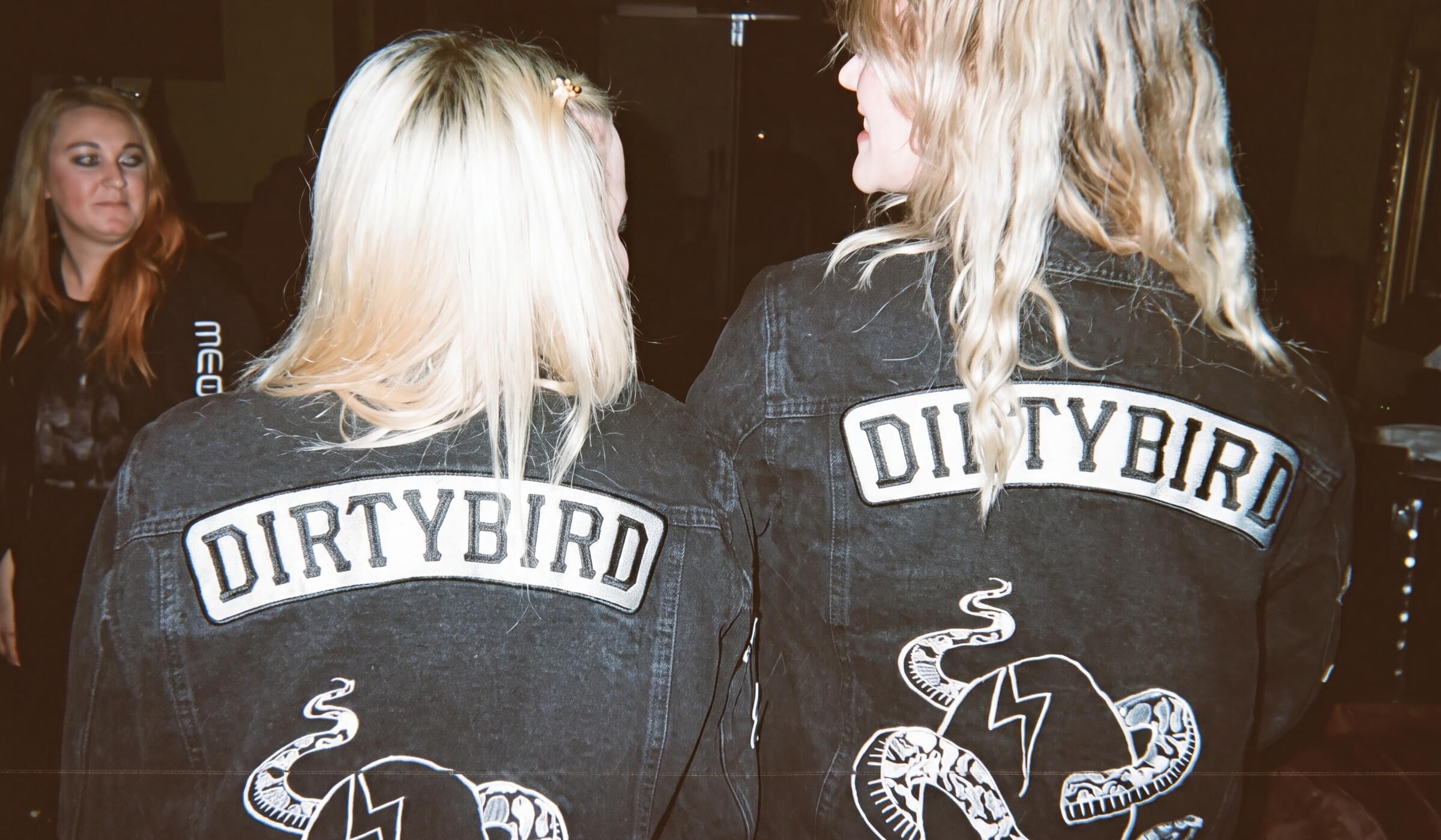
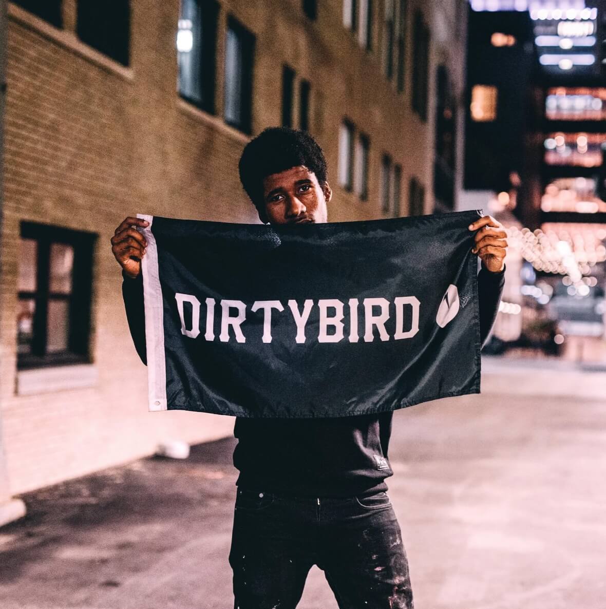
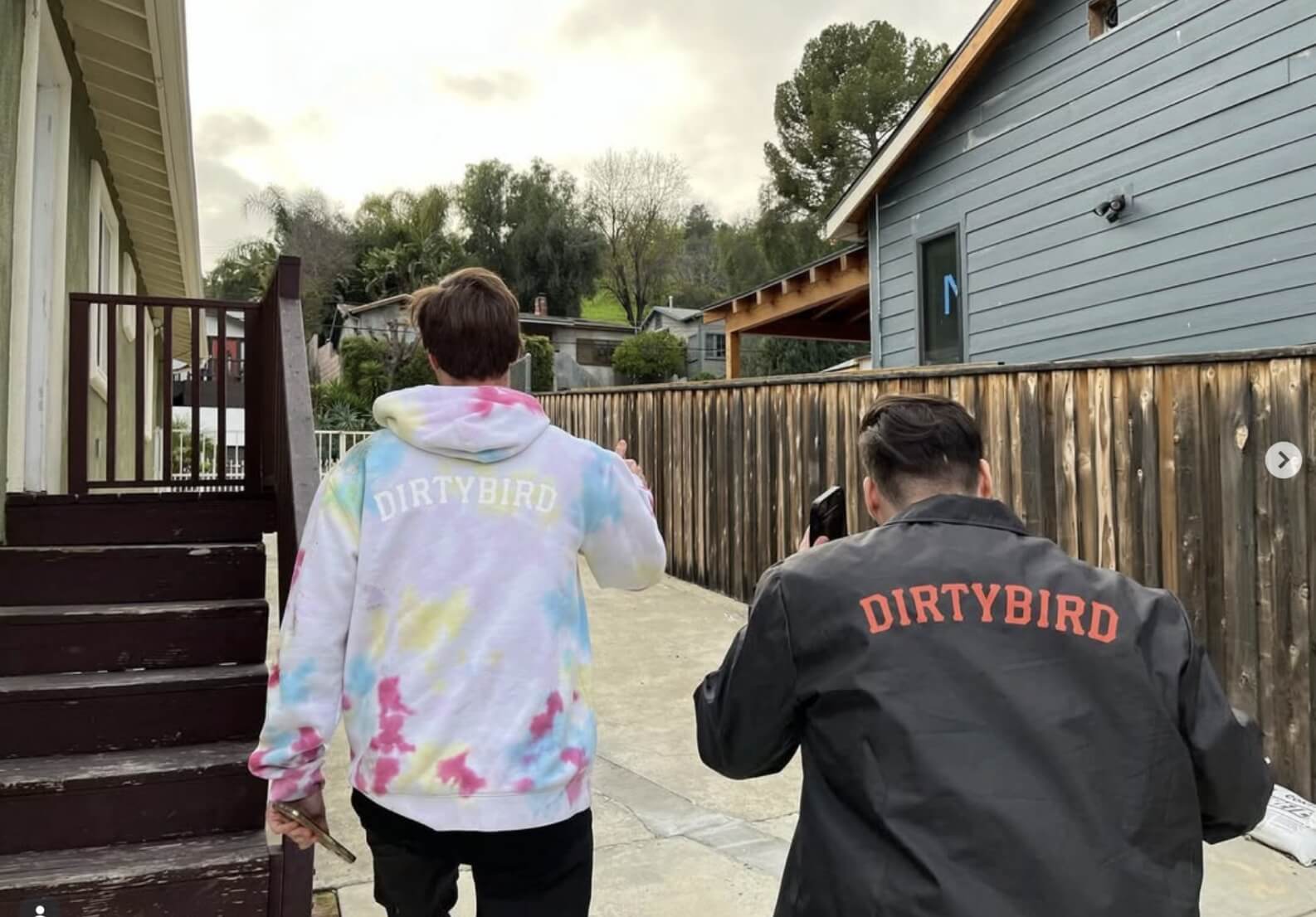
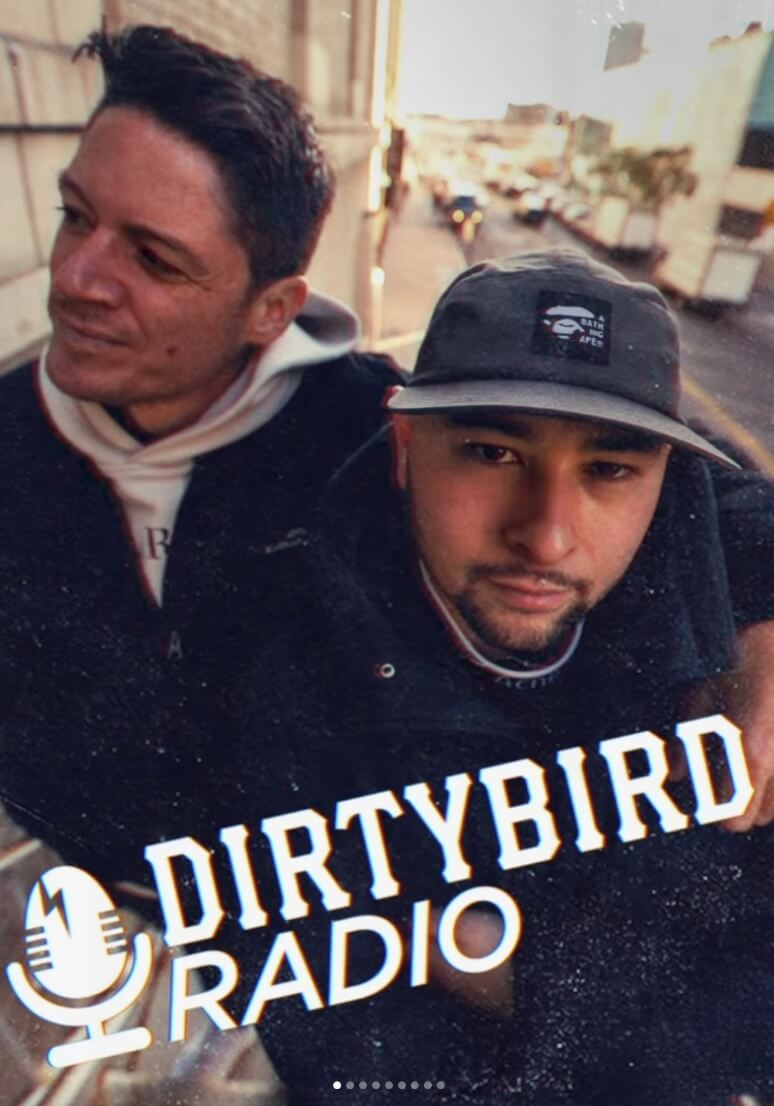
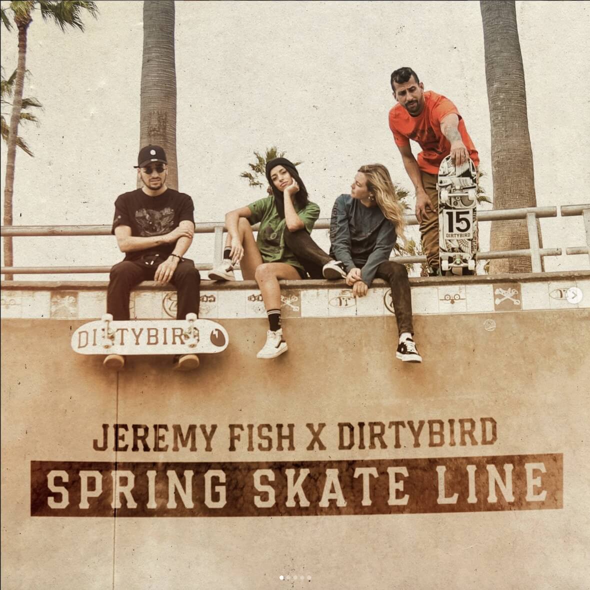
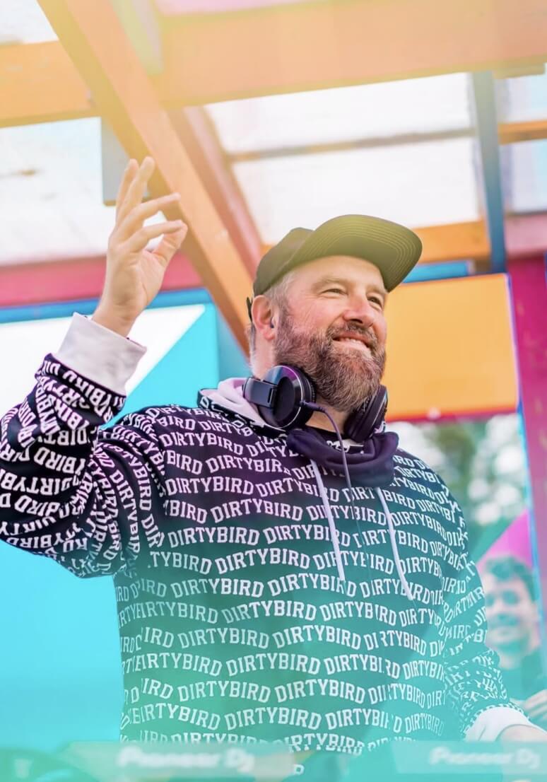
Nearly a decade later, the wordmark remains in active use across Dirtybird releases, album artwork, posters, flyers, merchandise, apparel and events. Its longevity has made it less a redesign moment than part of the label’s continuing visual legacy.
ONE LABEL, MANY EVENTS
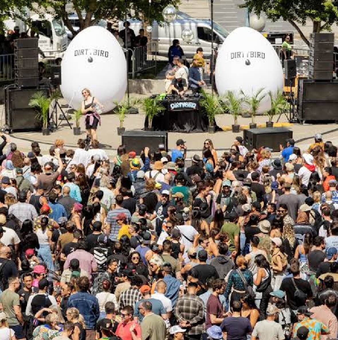
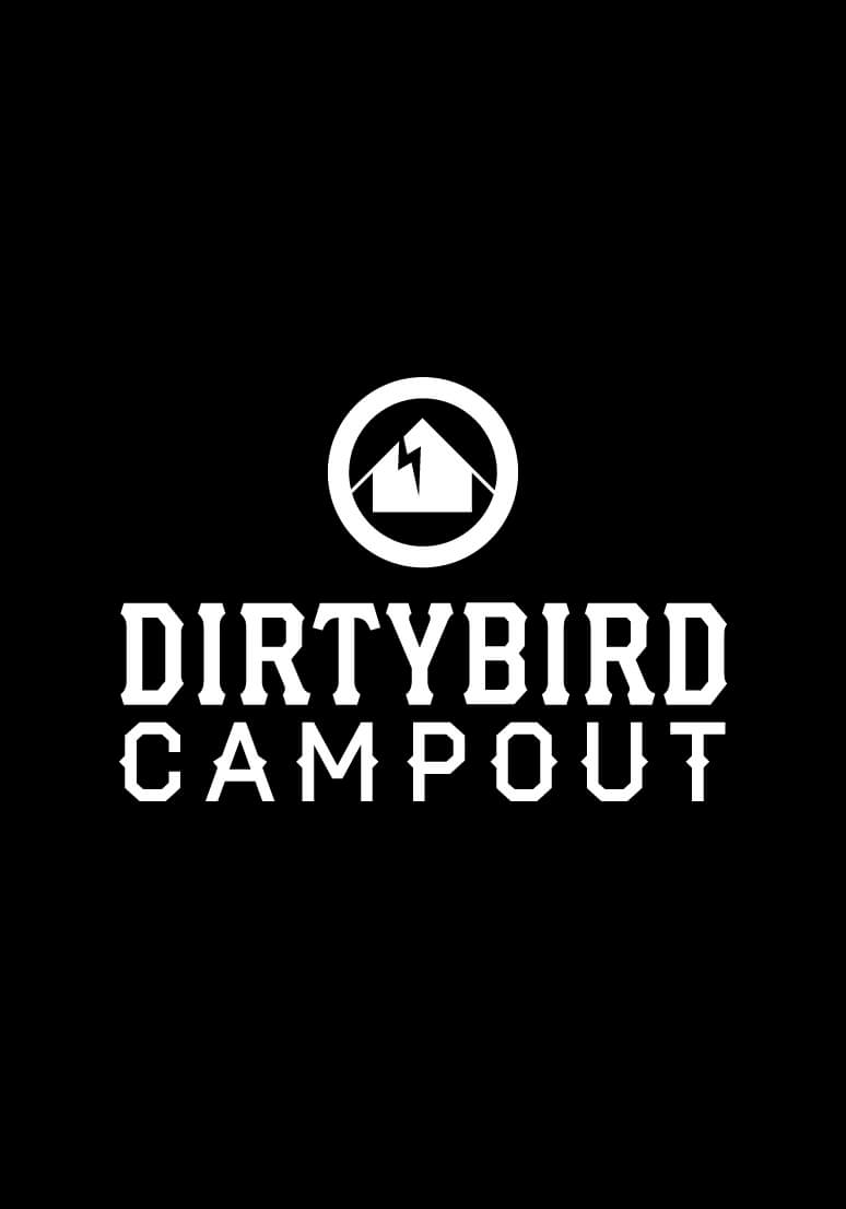
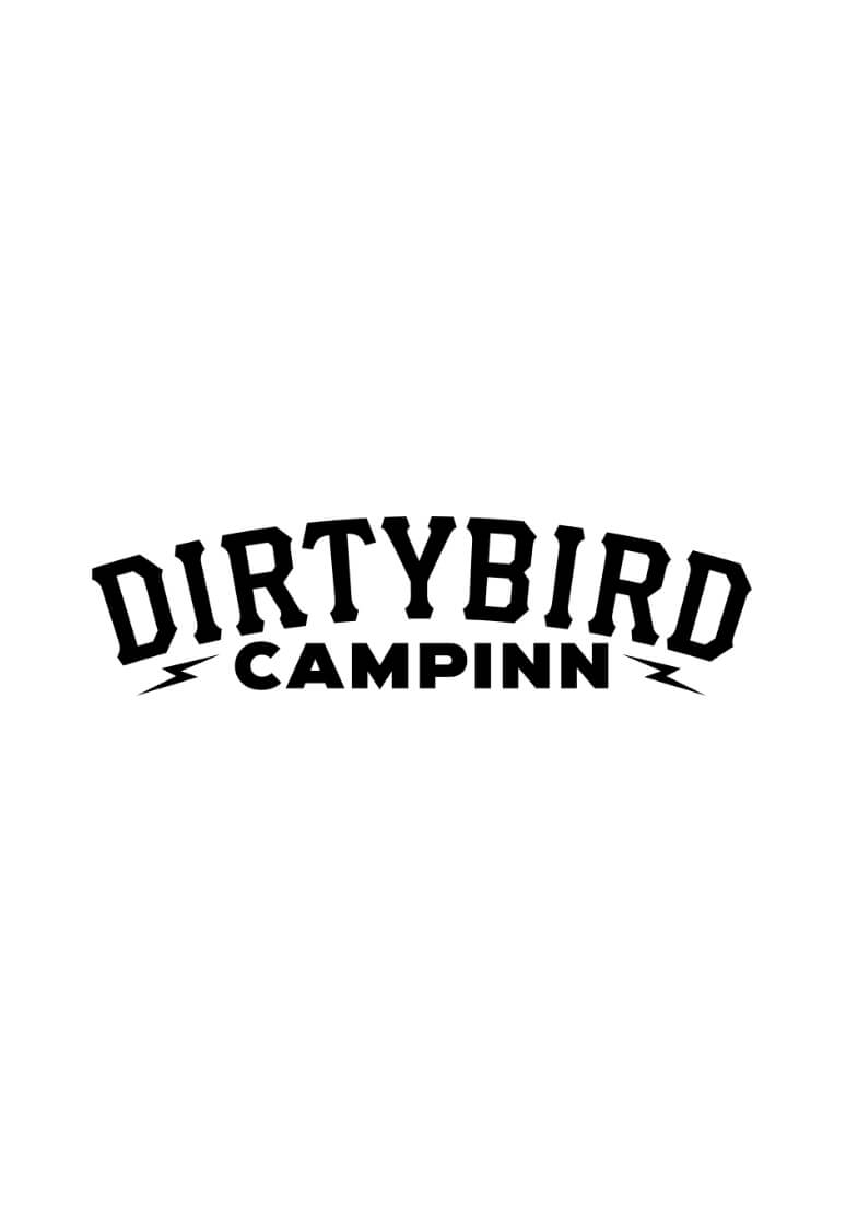
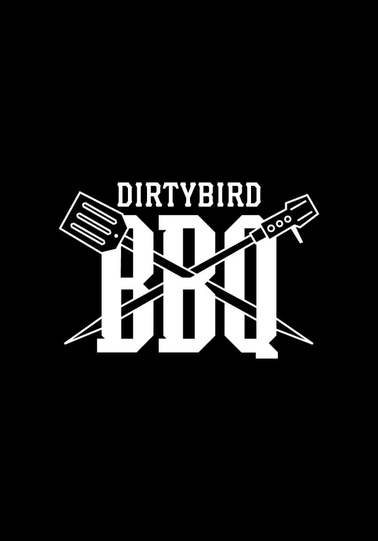
Dirtybird’s culture has always extended beyond recorded music. The wordmark became connective tissue across an expanding event ecosystem that included Dirtybird Campout, the touring Dirtybird BBQs, Dirtybird Players and Dirtybird CampINN.
Each property developed its own personality and context, from Campout’s adult-summer-camp world to BBQ’s touring cookouts, Players events and CampINN’s hotel takeover in Florida. Together, they formed a family of event identities visibly connected back to the label at the center of them.
FROM WORDMARK TO DIRTYFONT
The lettering did not stop at the logo.
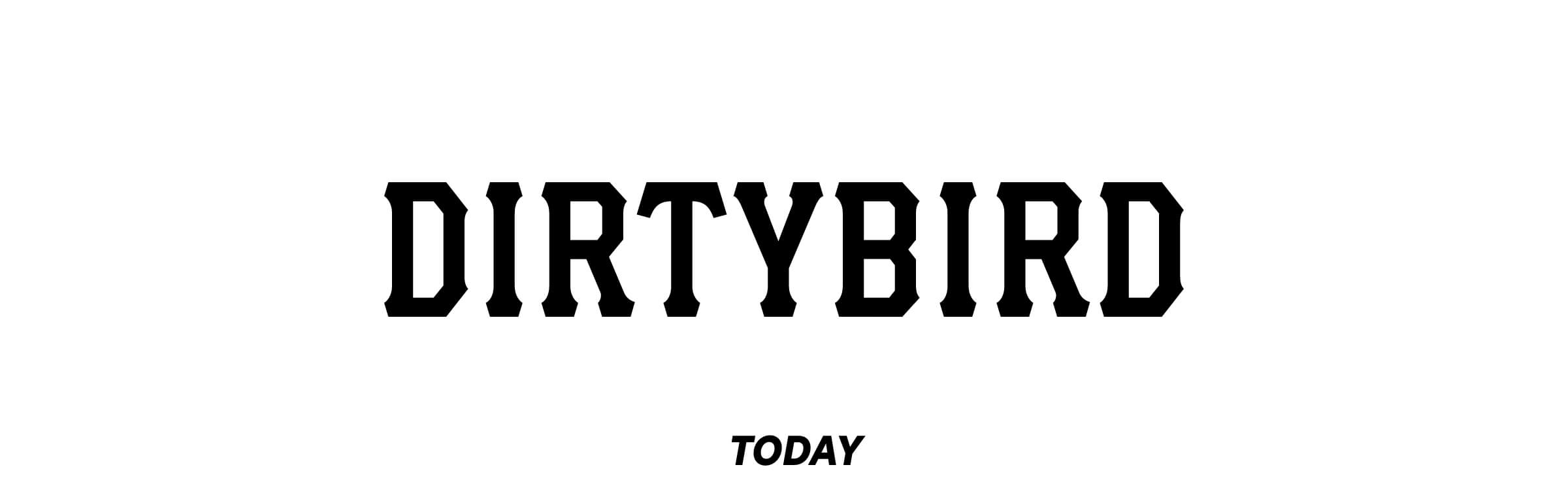
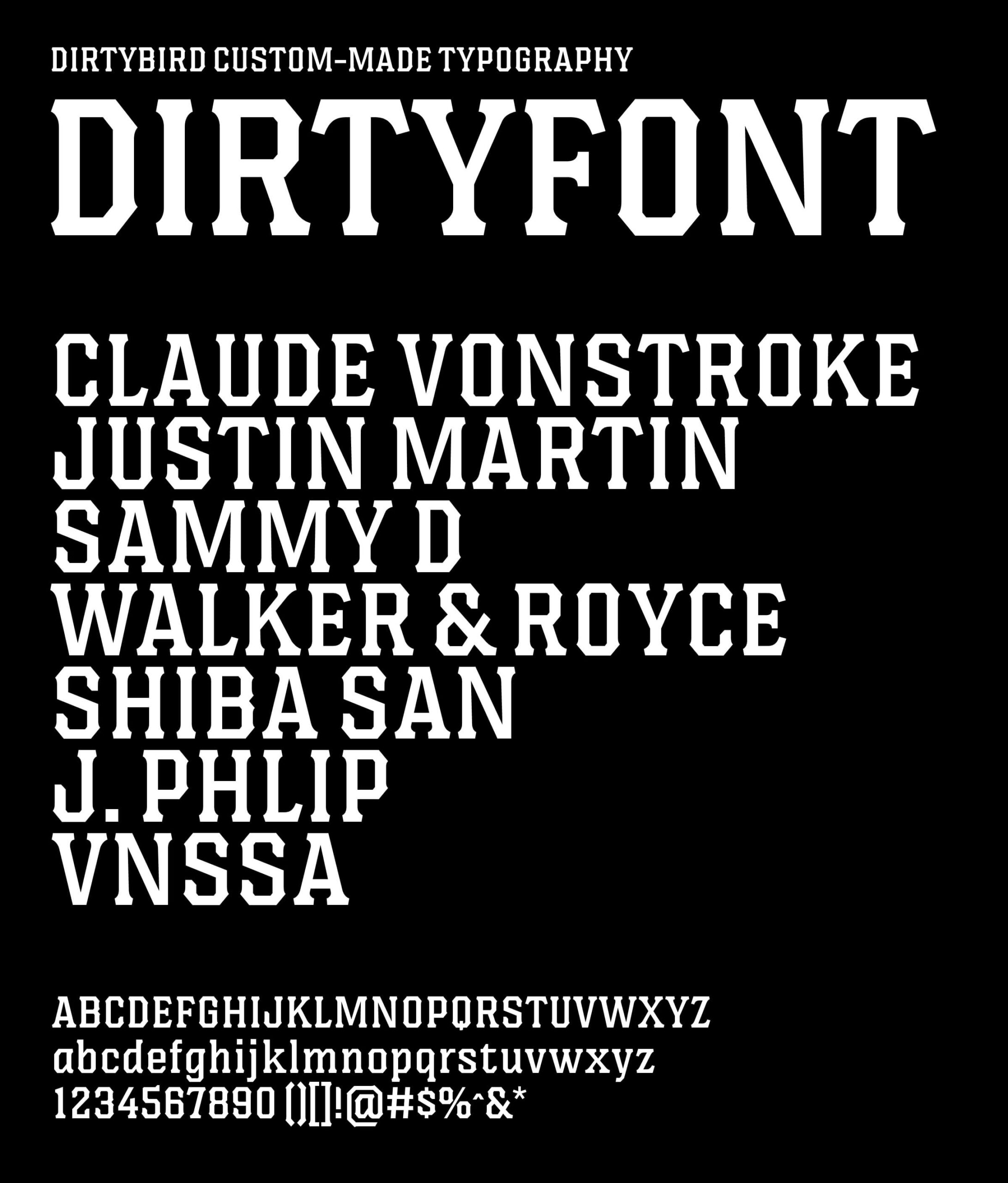
The custom forms created for the Dirtybird wordmark were expanded into Dirtyfont, a complete proprietary typeface that could be used throughout the brand. What began as a single piece of identity became a working asset across releases, campaigns, festivals, merchandise and communications.
Dirtyfont is still in use today, giving Dirtybird an ownable typographic language that has endured through new artists, new events, changes in ownership and almost a decade of cultural output.
The wordmark gave Dirtybird its name. Dirtyfont gave the tribe a language.
Selected Works
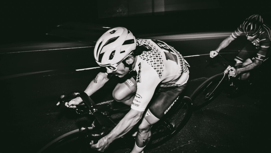
H&H Cycling TeamBrand Identity
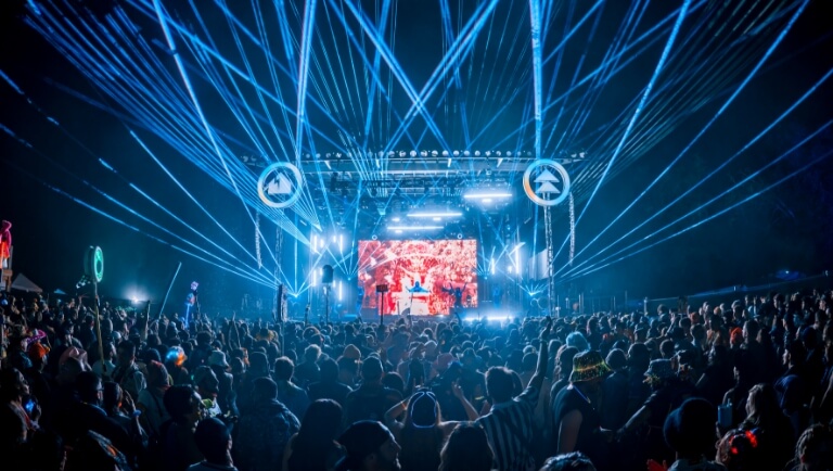
Northern Nights x Dirtybird CampoutVisual Identity & Event Marketing
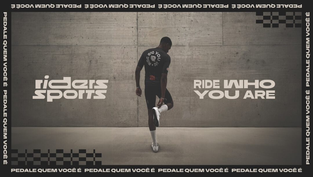
Riders SportsRebrand
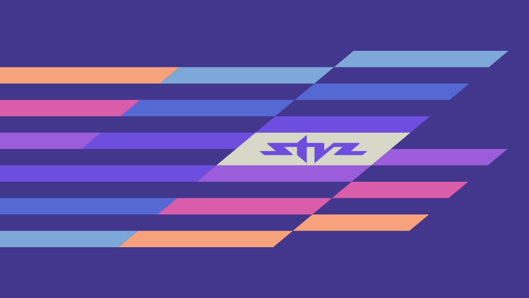
STVZ Road Cycling TeamBrand & Visual Identity

The Glorious IconBrand Strategy & Design

Glorious PackagingPackaging Design
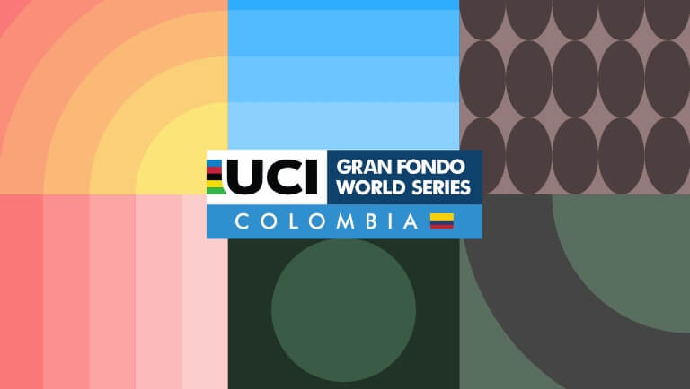
UCI Gran Fondo World Series Colombia 2025Visual Identity

AdRollLogotype Redesign
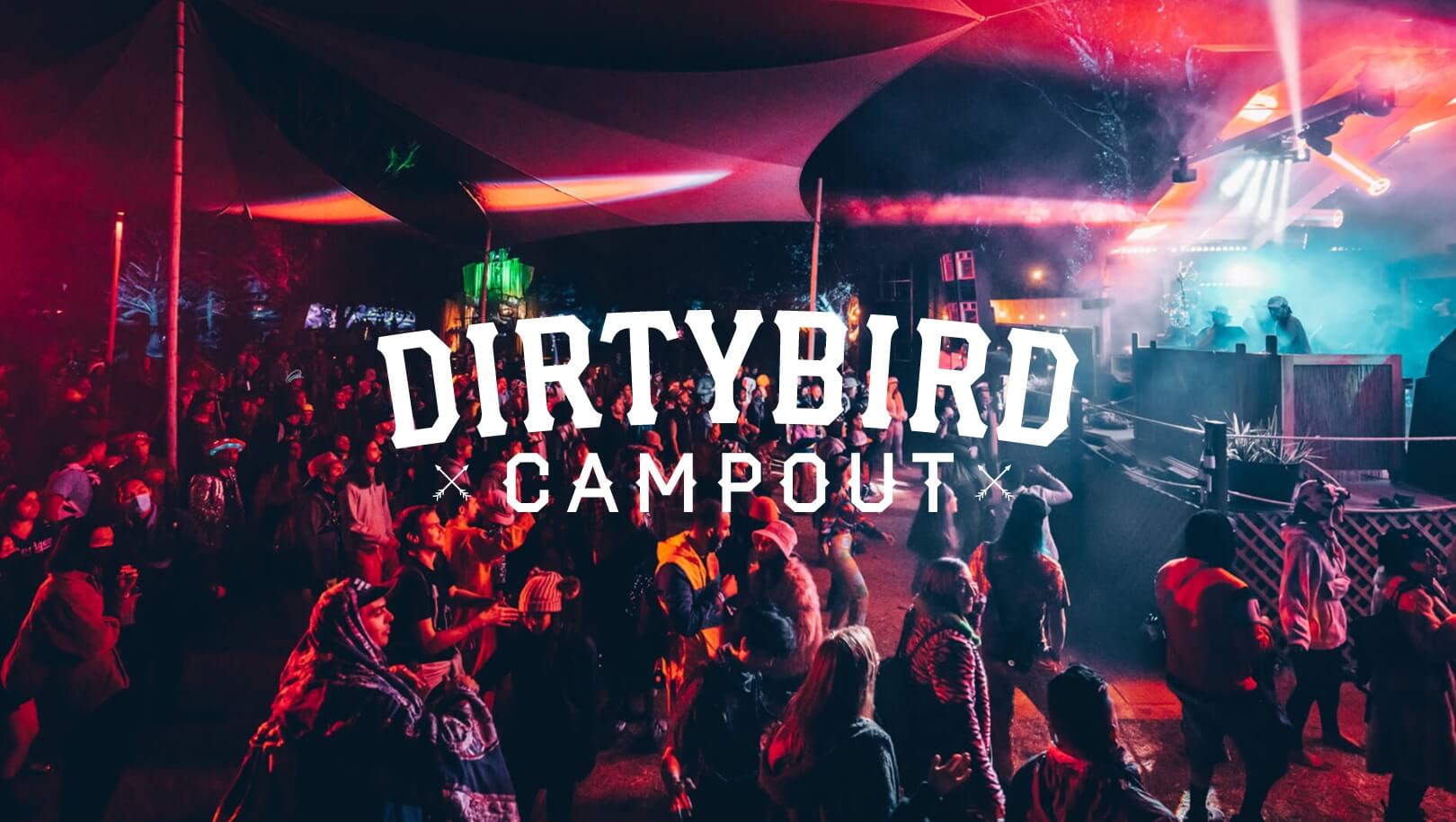
Dirtybird Campout Music FestivalVisual Identity & Event Marketing

Dirtybird 20Logo Design
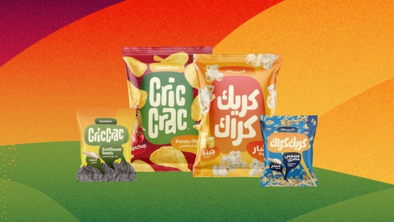
Cric Crac SnacksBrand, Visual Identity & Packaging Design

Color System for GMMK Pro Keyboard & AccessoriesColor Design for Products

NEW BUSINESS INQUIRIES
United States
San Francisco, California
hello@studiopicante.com
NUEVOS NEGOCIOS
Latin America
Buenos Aires, Argentina
hola@studiopicante.com
Press Inquiries
press@studiopicante.com
Jobs & Collaborations
jobs@studiopicante.com
All content on this website is the exclusive property of Studio Picante ©. Any reproduction, use, or modification of these materials is prohibited unless authorized through a written agreement. Studio Picante ©2026. All rights reserved.