
RIDERS SPORTS
___ Rebrand
Over a decade, the company evolved from a bike shop in Santa Catarina into a broader cycling business spanning premium retail, community and international competition. Its growing role across UCI events in Latin America marked a new chapter for the company.
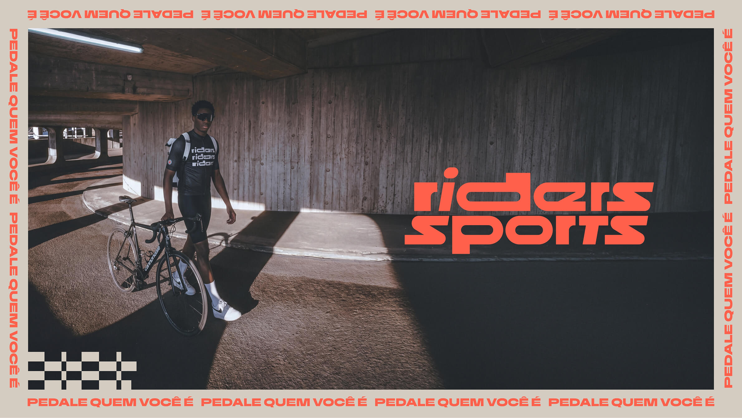
The identity needed to feel as credible at a UCI start line as it did inside its own shop, without losing the immediacy and character that made Riders feel part of cycling in the first place.
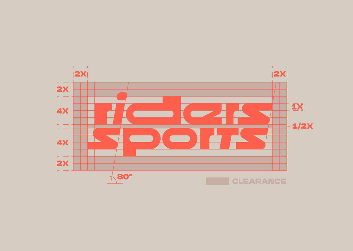
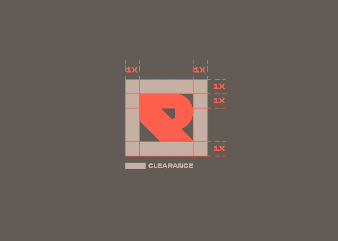
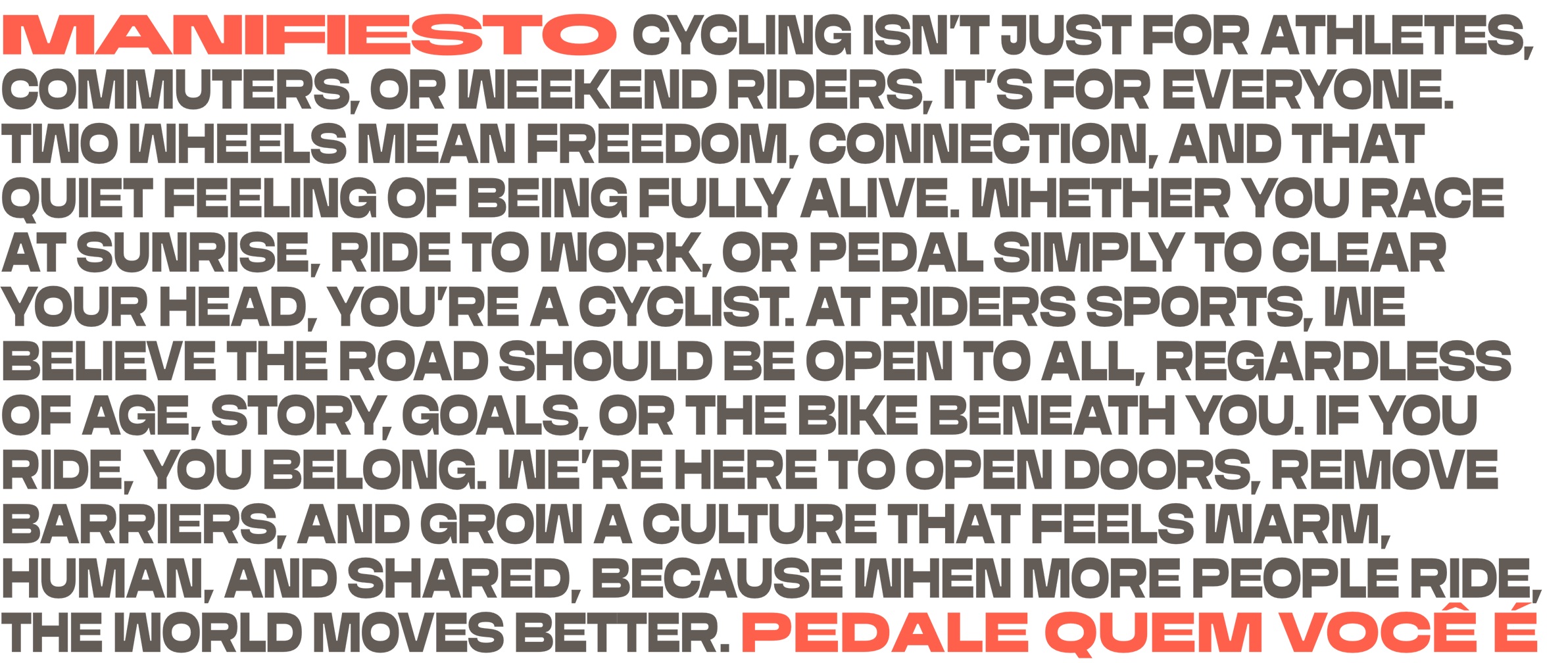
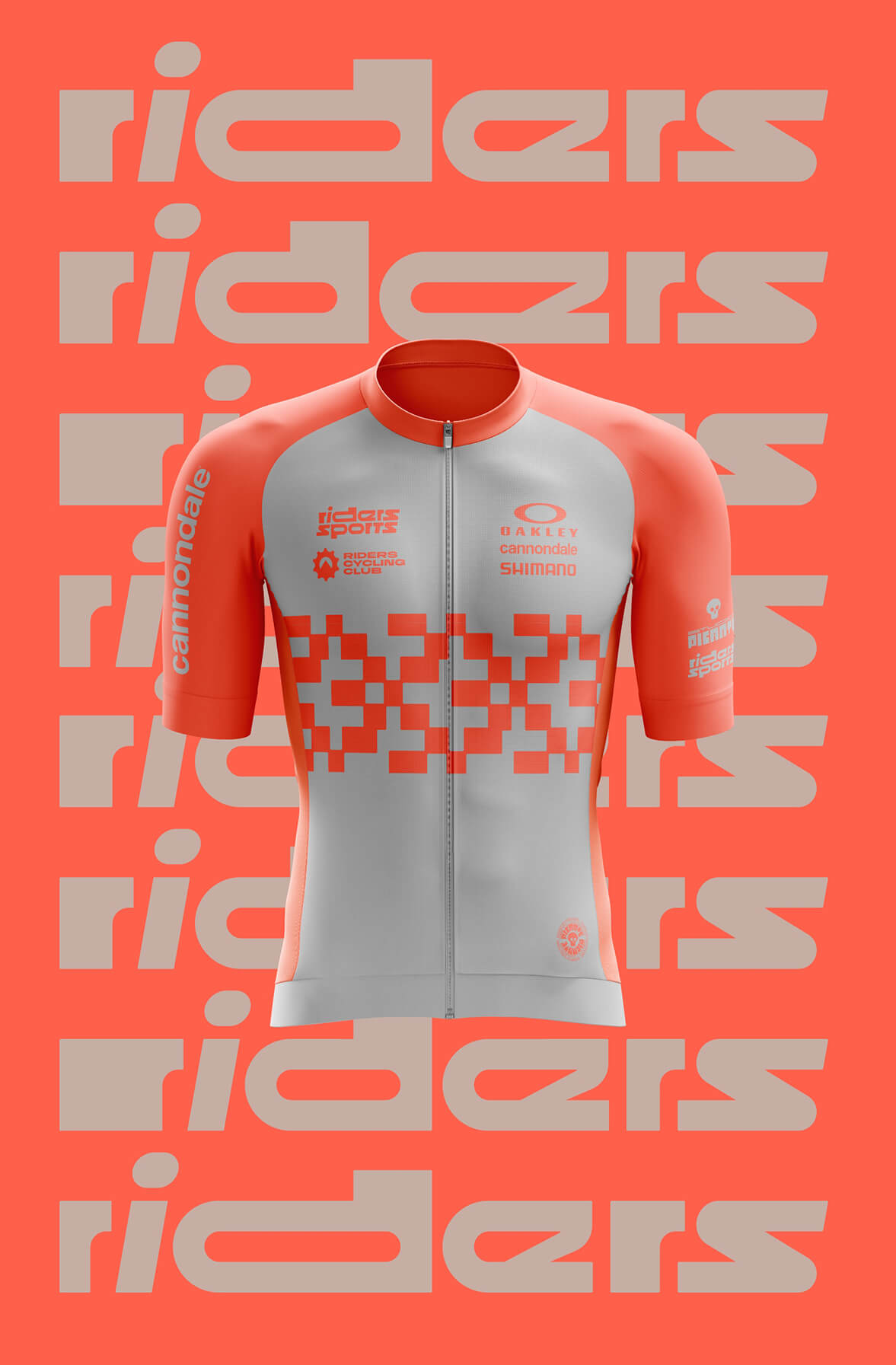
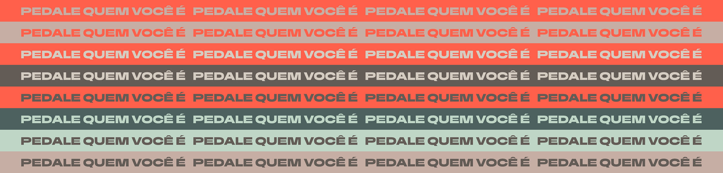
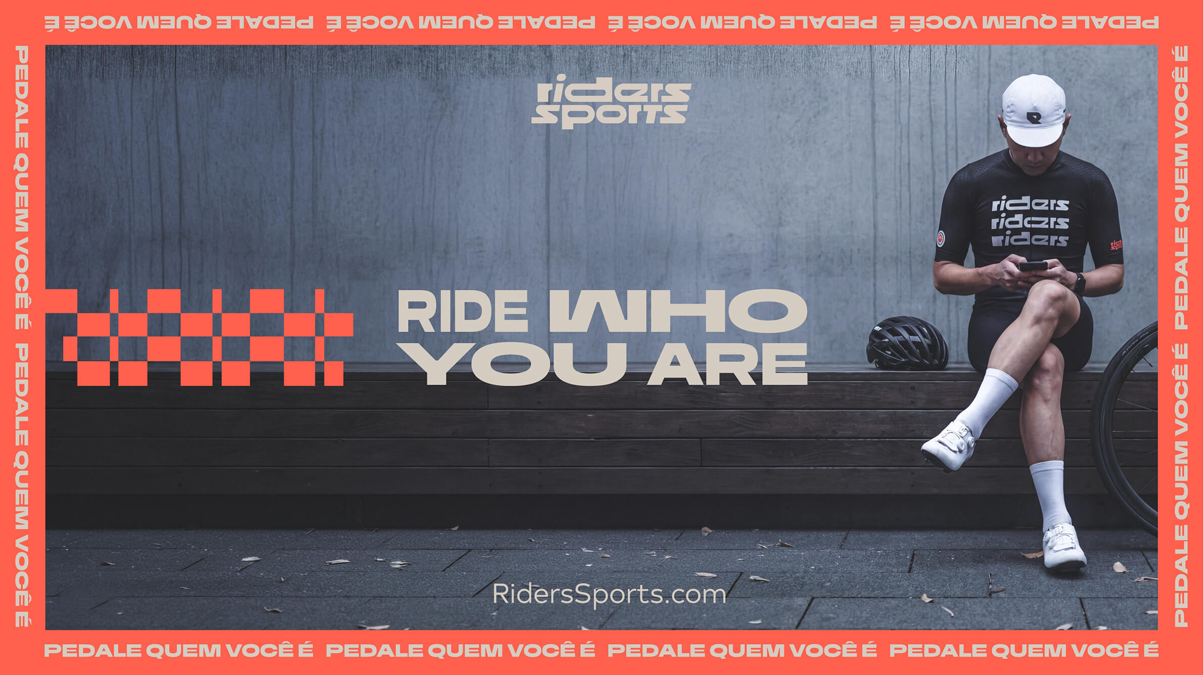
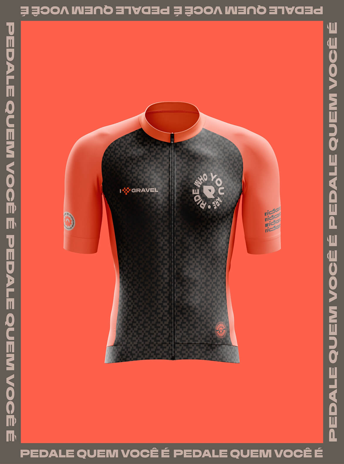
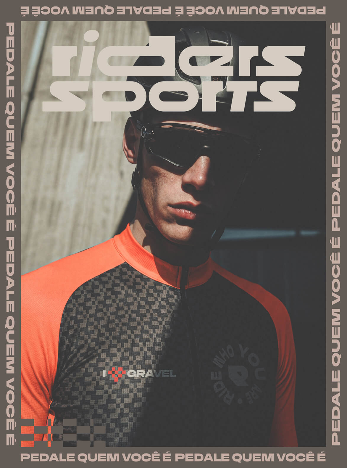
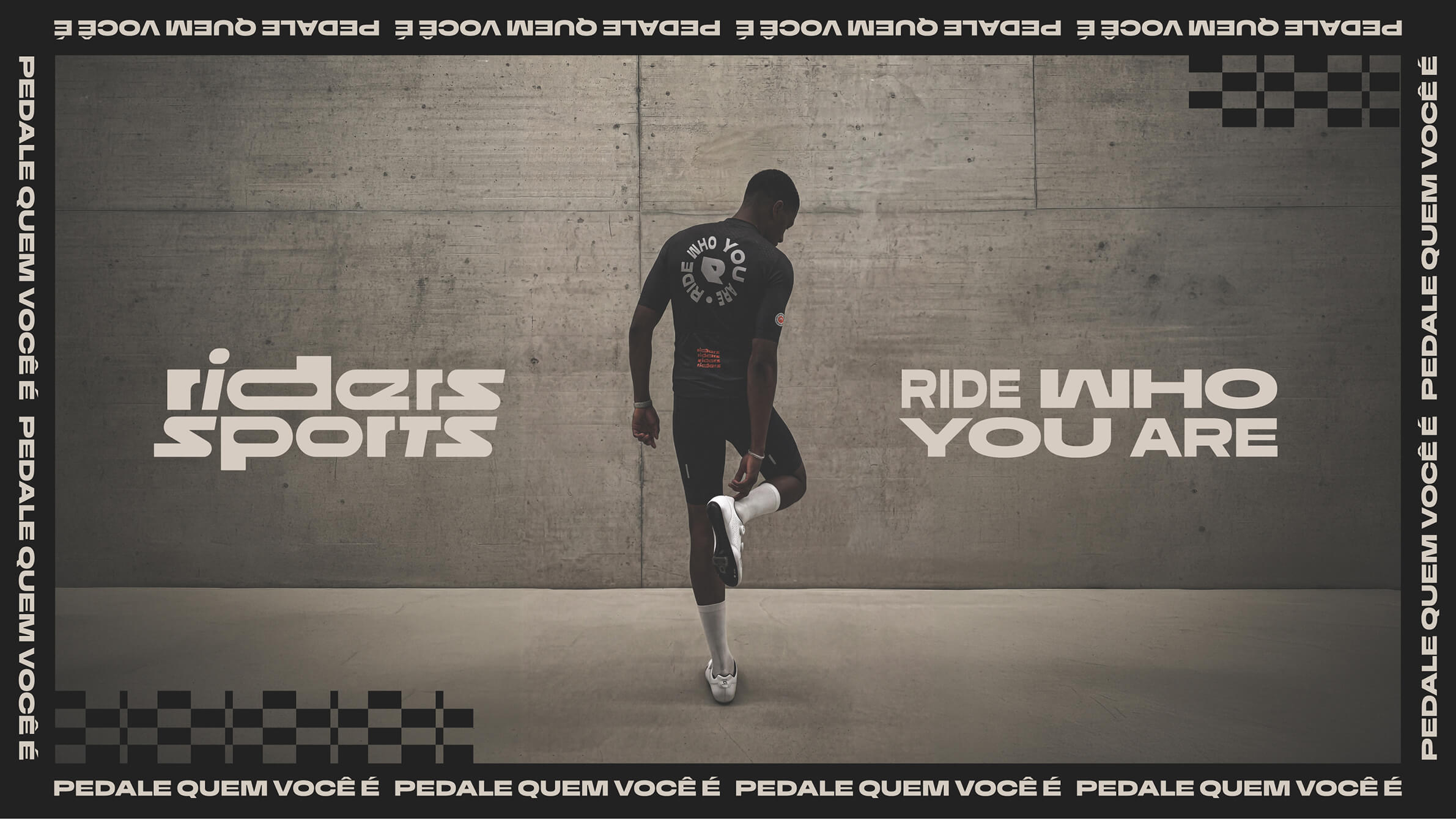
The rebrand brought positioning, brand architecture and visual identity into one system. At its center is a compact, forward-leaning wordmark, supported by an R monogram designed to carry the identity across smaller applications.
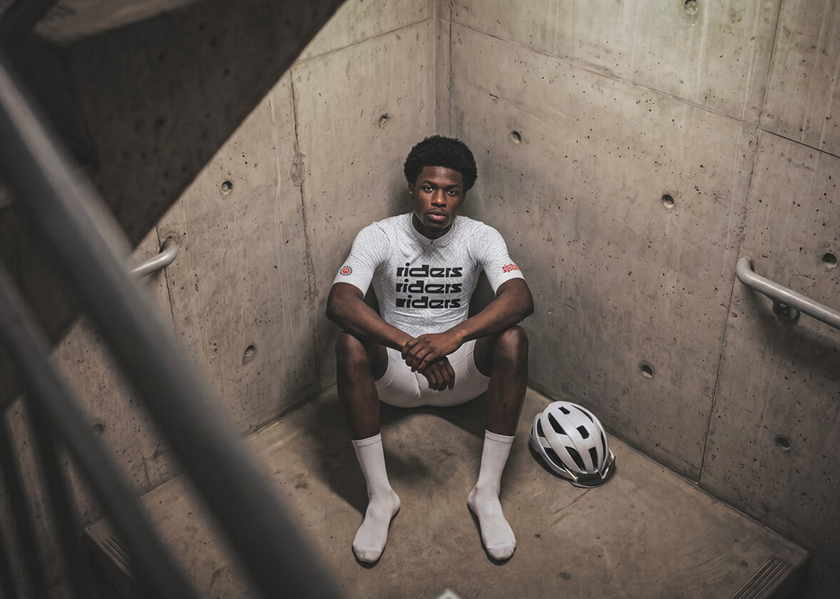
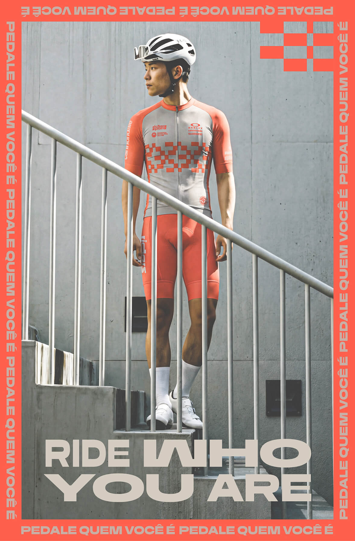
The system now runs across Riders’ retail presence, apparel, partnerships and international UCI events in Brazil, Chile and Colombia, giving the company one identity across the different worlds it operates in.
Brand: Riders Sports
Industry: Cycling
Region: LATAM
Recognitions: Communication Arts 2026 (Shortlisted)








Selected Works
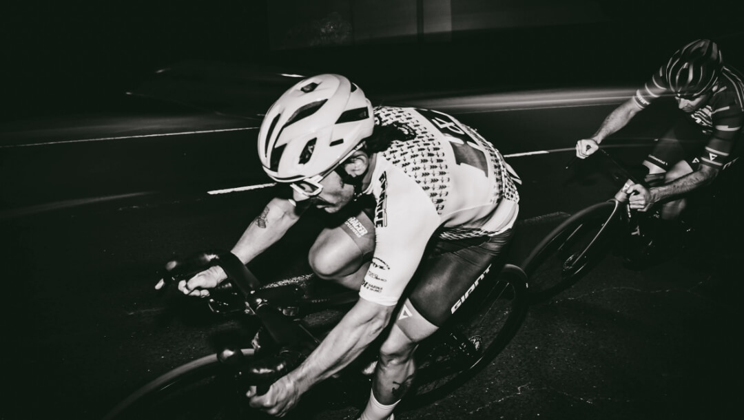
H&H Cycling TeamBrand Identity

Northern Nights x Dirtybird CampoutVisual Identity & Event Marketing

STVZ Road Cycling TeamBrand & Visual Identity

The Glorious IconBrand Strategy & Design

DirtybirdLogotype Redesign

Glorious PackagingPackaging Design

UCI Gran Fondo World Series Colombia 2025Visual Identity

AdRollLogotype Redesign
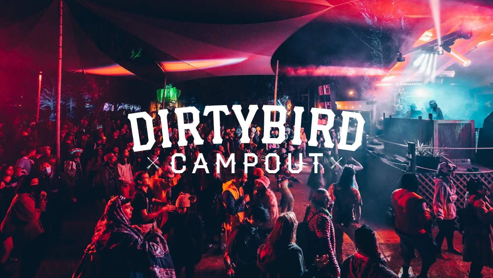
Dirtybird Campout Music FestivalVisual Identity & Event Marketing

Dirtybird 20Logo Design
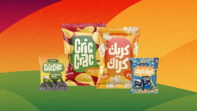
Cric Crac SnacksBrand, Visual Identity & Packaging Design

Color System for GMMK Pro Keyboard & AccessoriesColor Design for Products


NEW BUSINESS INQUIRIES
United States
San Francisco, California
hello@studiopicante.com
NUEVOS NEGOCIOS
Latin America
Buenos Aires, Argentina
hola@studiopicante.com
Press Inquiries
press@studiopicante.com
Jobs & Collaborations
jobs@studiopicante.com
All content on this website is the exclusive property of Studio Picante ©. Any reproduction, use, or modification of these materials is prohibited unless authorized through a written agreement. Studio Picante ©2026. All rights reserved.