
THE GLORIOUS ICON
___ Logotype Design / Branding
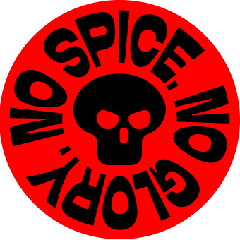
Glorious had built significant recognition around a symbol created for an earlier version of the company. As the brand expanded from its niche, meme-driven origins into a global gaming hardware business, that original headmark remained one of its most recognizable assets, appearing across products, packaging, digital platforms and community touchpoints.
The opportunity was to evolve an established piece of brand equity rather than replace it. The new headmark retained the recognition Glorious had built while giving the company a symbol better suited to a broader audience and a more mature global business.
Developed over nearly a year, it became a central identifier across hardware, packaging, apparel and digital environments.
Brand: Glorious
Industry: Electronics / Gaming
Region: Texas, United States


BUILT INTO THE PRODUCT
For Glorious, the headmark had to function as a product mark as much as a brand mark. The same asset needed to work as a website favicon and social avatar, a microscopic serial marking, molded into PBT plastic, machined into aluminum, printed on packaging and reproduced on apparel.
That range made consistency a practical requirement, not simply a branding ambition. One mark needed to survive dramatically different scales, materials and manufacturing processes without fragmenting into separate versions.
Once introduced, the headmark moved across mice, keyboards, accessories, packaging, apparel and digital environments, becoming one of the most consistent identifiers across the Glorious ecosystem.


Selected Works
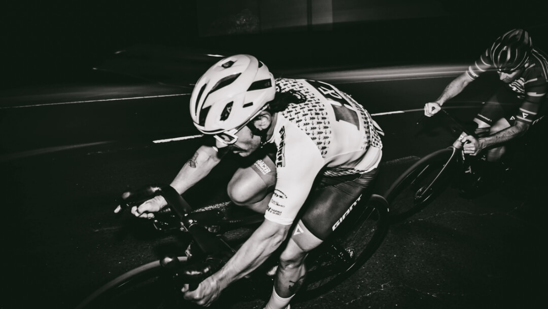
H&H Cycling TeamBrand Identity
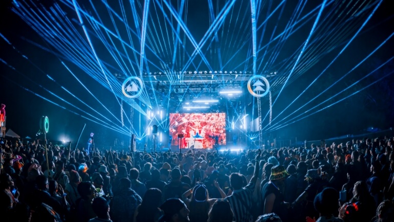
Northern Nights x Dirtybird CampoutVisual Identity & Event Marketing
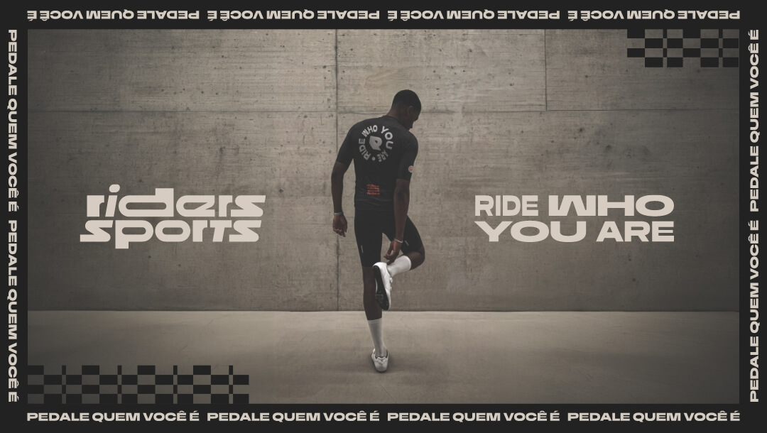
Riders SportsRebrand
STVZ Road Cycling TeamBrand & Visual Identity
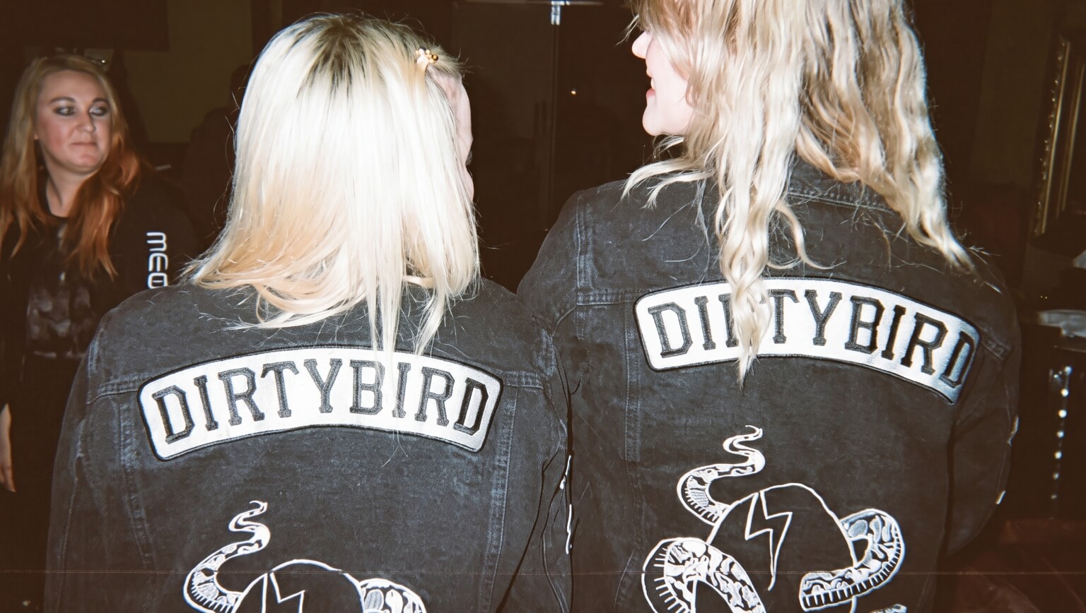
DirtybirdLogotype Redesign

Glorious PackagingPackaging Design
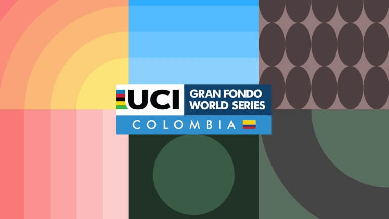
UCI Gran Fondo World Series Colombia 2025Visual Identity

AdRollLogotype Redesign
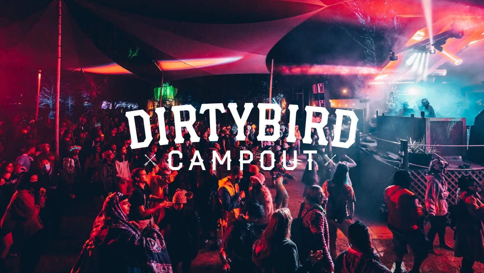
Dirtybird Campout Music FestivalVisual Identity & Event Marketing

Dirtybird 20Logo Design
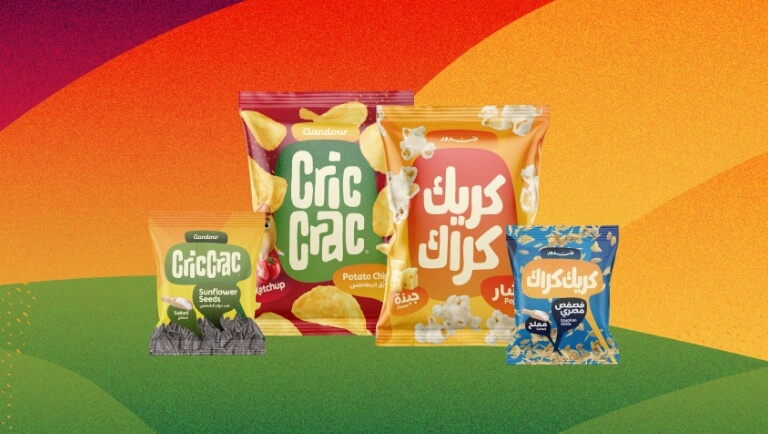
Cric Crac SnacksBrand, Visual Identity & Packaging Design

Color System for GMMK Pro Keyboard & AccessoriesColor Design for Products

NEW BUSINESS INQUIRIES
United States
San Francisco, California
hello@studiopicante.com
NUEVOS NEGOCIOS
Latin America
Buenos Aires, Argentina
hola@studiopicante.com
Press Inquiries
press@studiopicante.com
Jobs & Collaborations
jobs@studiopicante.com
All content on this website is the exclusive property of Studio Picante ©. Any reproduction, use, or modification of these materials is prohibited unless authorized through a written agreement. Studio Picante ©2026. All rights reserved.