THE GLORIOUS HEADMARK ICON
___ Logotype Design / Branding
The new Glorious logotype is the result of a thoughtful, year-long design process aimed at overcoming several challenges specific to the competitive PC gaming landscape. Seeking to break away from a niche, exclusive image, Glorious aimed to create an icon that reflects openness, inclusivity, and modern design principles. Through extensive research and design exploration—from monograms to innovative headmarks—the team developed a streamlined, gender-neutral silhouette that aligns with Glorious’ values of accessibility and community.
Beyond its visual appeal, the logotype was meticulously crafted for versatility. Designed to be legible across various formats and applications, it works seamlessly on everything from social media icons to tiny serial labels and embossed details on metal and PBT plastic. This adaptability is essential in meeting the high manufacturing demands and diverse material requirements of Glorious’ product range.
By prioritizing quality, design thinking, and a strong community connection, Glorious is positioning itself as a dynamic competitor in a market where design often feels outdated and repetitive. Through this commitment, Glorious is redefining what a gaming brand can be—authentic, inclusive, and forward-thinking—positioning itself confidently alongside industry leaders like Razer, Logitech G, and SteelSeries.
Client: Glorious
Industry: Electronics / Gaming
Region: Texas, United States

The Challenge
REDEFINING THE ICON
Opening Glorious to a Broader Gaming Community
The original Glorious headmark, though iconic, presented a challenge: it was rooted in a niche, meme-based identity that unintentionally signaled exclusivity, limiting the brand’s appeal in an evolving gaming market. Initially designed for a small community with a satirical edge, the logo’s associations created a barrier to broader audience engagement as Glorious aimed to become a more inclusive and accessible brand.
To support its growth ambitions, Glorious needed a reimagined visual identity that could embody values of openness, gender neutrality, and diversity without losing the loyalty of its core fan base. This meant evolving the headmark into a symbol that could authentically invite all gamers, removing any perceptions of elitism and creating an inclusive brand experience.
The updated logotype has played a pivotal role in driving Glorious’ exponential growth, positioning it alongside major players like Razer, Logitech G, and SteelSeries. The refreshed brand identity not only distinguishes Glorious in a competitive landscape but also strengthens its reputation as one of the top gaming electronics brands, uniting both seasoned enthusiasts and newcomers under one powerful, inclusive brand.


The Process
SIMPLICITY MEETS VERSATILITY
The Design Journey of the New Glorious Headmark
The redesign of the Glorious logotype took around a year and involved collaboration with a select group of shareholders, ensuring their insights shaped the brand’s evolution. The process began with extensive research and design exploration, moving from monograms to various headmark concepts. Ultimately, the team settled on a smooth, gender-neutral head silhouette that embodies simplicity, memorability, and versatility.
This logotype is crafted for adaptability across diverse applications, from aluminum CNC processes to fabric for apparel. It was designed to maintain legibility in smaller formats, like website favicons and social media profile pictures. This versatility positions the new Glorious logotype as a robust symbol that effectively represents the brand in a competitive landscape and manufacturing requirements.


The Ultimate Outcome
CHALLENGING THE NORM
Glorious’ Approach to Design, Quality, and Community in Gaming
In a competitive PC gaming market often saturated with outdated and predictable design, Glorious is making bold moves with a distinctive approach that combines high-quality products, user-focused design, and a community-first mentality. Where other brands rely on familiar aesthetics, Glorious leverages design thinking to deliver innovative solutions that stand out. Each product is crafted with attention to user experience, balancing functionality with a timeless, versatile look that transcends trends.
Glorious’ smart positioning also hinges on deep user understanding. By closely engaging with its community, the brand doesn’t just respond to gamers’ needs—it anticipates them, creating products that enhance the gaming experience from both performance and aesthetic standpoints. This community-driven approach creates an authentic connection with users, solidifying brand loyalty in a crowded marketplace.
This dedication to quality, thoughtful design, and user connection allows Glorious to step confidently into the competitive landscape, establishing itself as a modern, responsive brand alongside established names like Razer, Logitech G, and SteelSeries. Through this commitment, Glorious sets a new standard in the PC gaming world, effectively challenging industry norms and fostering a unique identity that resonates with today’s gamers.


Selected Works

H&H Cycling TeamBrand Identity

UCI Gran Fondo World Series Colombia 2025Visual Identity
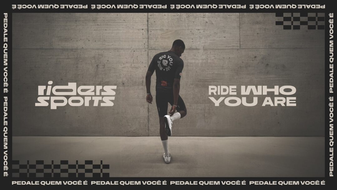
Riders SportsRebrand

AdRollLogotype Redesign

Dirtybird 20Logo Design

STVZ Road Cycling TeamBrand & Visual Identity

Glorious PackagingPackaging Design

State of the DappsUI/UX Web Design

Lettering LogosLogo Design

Pura FruttaBrand, Visual Identity & Packaging

MobuLogotype & Visual Identity

Cric Crac SnacksBrand, Visual Identity & Packaging Design

CatecorpBrand & Visual Identity

Dirtybird Campout Music Festival 2019Brand & Visual Identity

Dirtybird Campout Music Festival 2021Brand & Visual Identity

CoinbooksUI/UX Web Design

Dirtybird BBQ Music FestivalBrand & Visual Identity

Adobe Live's Jump FestivalBrand Strategy & Design

Color System for GMMK Pro Keyboard & AccessoriesColor Design for Products

BlockbutlerUI/UX Web Design

Adobe Live's Sham SodaBrand & Packaging Design

WoomplUI/UX Web Design

Let’s set up a discovery call and take your brand & product to the next level
United States
San Francisco, California
hello@studiopicante.com
LATAM
Buenos Aires, Argentina
hola@studiopicante.com
Press Inquiries
press@studiopicante.com
Job Opportunities
jobs@studiopicante.com
All content on this website is the exclusive property of Studio Picante ©. Any reproduction, use, or modification of these materials is prohibited unless authorized through a written agreement. Studio Picante ©2024. All rights reserved.