H&H ROAD CYCLING TEAM
___ Brand Identity
H&H, short for "Harina & Humo," is a cycling team from Buenos Aires composed of five close friends who compete in fondo and criterium races. The name itself is a nod to their unique ethos—"Harina" (wheat) represents the essential carbohydrates fueling their rides, while "Humo" (smoke) hints at their laid-back spirit and unconventional pre- and post-ride rituals. This duality of intensity and chill defines their approach to the sport.
The H&H logotype is a striking monogram combining the two Hs and the ampersand (&), encapsulating competition, boldness, strength, and power. The sharp, confident structure of the logo reflects the team's competitive nature while maintaining an edge of playfulness.
For the visual identity, we introduced a character inspired by the iconic mascot of Jorgito, a beloved Argentine brand of alfajores. Our reinterpretation plays on that recognizable, endearing aesthetic but with a twist—this character embodies the team's fearless and carefree attitude, appearing both daring and hilariously high. The result is an instantly memorable figure that resonates with the team’s personality and philosophy.
To further solidify the visual identity, a set of custom patterns was designed. The standout pattern, used on their competition jersey, features the "less-than sign (<)" symbol arranged to cleverly represent both wheat and smoke—two essential elements of the H&H lifestyle. The repetition of these symbols creates a dynamic yet subtle nod to their name and ethos, making their racing kit not just a uniform but a statement.
The H&H cycling team’s visual identity is an audacious blend of competition and irreverence. It captures their raw power on the track while embracing their relaxed and unique approach to the sport. The combination of a bold logotype, a mischievous mascot, and clever symbolic patterns makes this identity unmistakably H&H—daring, unapologetic, and completely one of a kind.
Client: H&H Road Cycling Team
Industry: Cycling
Region: Buenos Aires, Argentina


Selected Works

UCI Gran Fondo World Series Colombia 2025Visual Identity
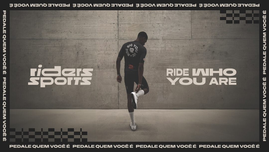
Riders SportsRebrand

AdRollLogotype Redesign

Dirtybird 20Logo Design

STVZ Road Cycling TeamBrand & Visual Identity

Glorious PackagingPackaging Design

State of the DappsUI/UX Web Design

Lettering LogosLogo Design

Pura FruttaBrand, Visual Identity & Packaging

MobuLogotype & Visual Identity

Cric Crac SnacksBrand, Visual Identity & Packaging Design

CatecorpBrand & Visual Identity

Dirtybird Campout Music Festival 2019Brand & Visual Identity

Dirtybird Campout Music Festival 2021Brand & Visual Identity

CoinbooksUI/UX Web Design

Dirtybird BBQ Music FestivalBrand & Visual Identity

Adobe Live's Jump FestivalBrand Strategy & Design

Color System for GMMK Pro Keyboard & AccessoriesColor Design for Products

BlockbutlerUI/UX Web Design

The Glorious IconBrand Strategy & Design

Adobe Live's Sham SodaBrand & Packaging Design

WoomplUI/UX Web Design

Let’s set up a discovery call and take your brand & product to the next level
United States
San Francisco, California
hello@studiopicante.com
LATAM
Buenos Aires, Argentina
hola@studiopicante.com
Press Inquiries
press@studiopicante.com
Job Opportunities
jobs@studiopicante.com
All content on this website is the exclusive property of Studio Picante ©. Any reproduction, use, or modification of these materials is prohibited unless authorized through a written agreement. Studio Picante ©2024. All rights reserved.